"Let me be the one for you, otherwise we need to work on communication". Basically this was a very brief description of a recent use case for a power view report which had been later replicated in a Power BI slide as well.
Users were aware of PowerView / Power BI limitation (as of 2015-July-27) of not having filters with a single choice of values to select. PowerView slicers could be a good solutions for this, which would allow having that single value selection functionality (Power BI slicers still need to be improved); and use of regular filters has been a more preferable choice in order to have more room for useful visualizations within a report.
However users usually get confused by selecting multiple values for a particular filter, which might lead to improper data discoveries. And then they simply asked, "Yes, we understand PowerView behaviour and we understand that we make mistakes with a multiple filter's values selection. Show us then an error message in our report so that we would be aware about this mistake".
It was easier to tell them that they should properly operate with their filters, however I decided to explore PowerView / Power BI functionality a bit more if it would allow some custom error messages, before taking the easy path.
First, I pulled a sample data from a Wikipedia page (https://simple.wikipedia.org/wiki/List_of_countries_by_population) with countries' populations statistics into my data model;
and also exported some lookup data for parameters:

Then I created a simple visualization of this data along with 2 slicers: Population Group & Region.

Then for 'Country by Population' table I added 3 DAX measures:
Region Selected = COUNTROWS(FILTERS(Regions[Region]))
PopulationGroup Selected = COUNTROWS(FILTERS(PopulationGroup[Population Group]))
MultipleSelected = if(OR([Region Selected]>1,[PopulationGroup Selected]>1),1,0)
And one measure for the CurrentDate table:
ShowError = if([MultipleSelected], [MultipleSelected]*MIN([MessageType])+1, MAX([MessageType]))

Then I applied ShowError to the Top Left table region with CurrentDate table data:

and MultipleSelected to the main chart in order to control visual behavior of the top table region and this main chart correspondingly.

And it worked! If I selected more than one value from any of the slicers, then the Top table region would show a defined error message (instead of a report date value, please see the slide with this visualization at the beginning of the post) and main chart would become blank:
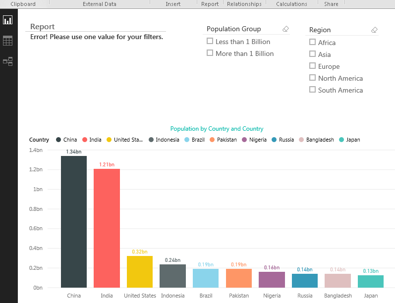
Also, I realized that with this chart's bars hiding I have found a bug with the Power BI charts in general (which I believed would be fixed soon) that data labels were still visible while data bars were not, which didn't make any sense.

This very same reports was originally developed in PowerView:

And both Power BI and PowerView files can be found here:
So at least some communication back to users was possible in Power BI, and I think there will be more and more improvements in this Power BI area :-)
Happy data adventures !
Comments
Post a Comment